Pocket PC UI Suggestions
by Jason Dunn, July
18th, 2000
Although the overall UI of the Pocket PC is greatly enhanced and easier to use, there's one element I've always wished was different: appointment reminders!
I'm one of those users that crams a lot of information into an appointment, and it's usually in the subject line. Why? Outlook 2000 makes it very easy to drop appointments into the calendar: you click once on the time you want the appointment to start, and just start typing. For a great deal of information, I'll put it in the notes field. Either way, I include driving directions, special instructions that I need to follow, notes about who I'm meeting with, etc. The support on the Pocket PC for more than a few characters in the subject line is very weak.
One of the complains I often hear in the newsgroups from ex-Palm owners is the lack of a text wrap. For instance, on a contact information field, the text on a Palm will wrap, showing you the full email address. On a Pocket PC if the field is too long it simply truncates it. For most fields, this is ok - in the contact entry there's plenty of space for phone numbers, etc, but for web & email addresses (which can be long) it truncates the data. This is especially frustrating now that it only displays the fields with data - there is a lot of open space being unused.
Related to this issue is the way the space is used in other applications, specifically the calendar application the reminder screens. Below are a series of screen shots with accompanying descriptions that should illustrate my point.
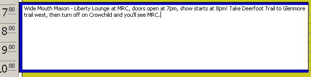
This is an example of how I often enter data into my calendar - click and type. It's much faster then going FILE > NEW > APPOINTMENT and entering the data in the appropriate fields. I don't know if Microsoft has done any studies about how people normally enter new appointments, but I don't believe my method is unusual. Using this entry as an example (it's fairly typical for me) let's look at how the OS deal with it.
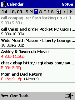 |
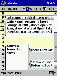
The agenda view of the
Calendar app shows me enough to jog my memory about what this
appointment is, but no more than that. If there were only one or two
appointments here, I'd have a lot of open space being unused. Why not
have it wrap the text and show all the data? Or be an option?
To view the subject line, I have to open up the appointment... |
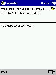 |
...which shows me less of
the subject line than before because of the icon. So I need to tap the
subject line again...
(if I had entered the directions under the NOTES field, the content would be displayed here) |
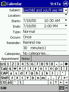 |
...which puts me smack in the middle of the subject line... |
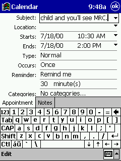 |
...the only way to see all of the subject line is to tap though each screen to see it. |
 |
This view is the only one with the capacity to show enough content to be useful, but only if the appointment duration is long enough to hold the text. With CE 2.11, I would sometimes tap and drag the duration to expand it so I could see more of the text. This feature has been removed from the Pocket PC OS, making it a 4+ tap process. |
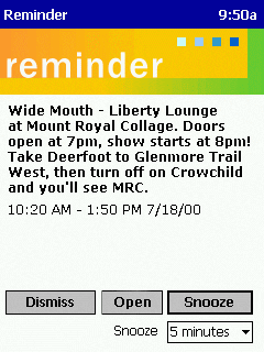
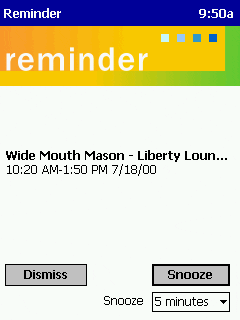 |
This is the current reminder
view. Look at all the wasted space! I find this frustrating to look at -
a lot of open space, yet I can only see 40-50 characters of my reminder
subject line.
There's also no option to OPEN the appointment, so even if I did have directions in the notes field, I can't quickly get at them. I frequently look at my Pocket PC for driving directions, and right now there's no easy way for me to have these directions on the screen at all times. I can only dismiss the reminder and go into the calendar and open up the notes field. |
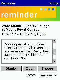 |
This is one idea I have for
the UI, and it incorporates several improvements:
1) Text wrapping has been added to the reminder subject field - it makes better use of the space 2) The notes field is displayed below in a box - if the scroll bar was mapped to the rocker bar/pad on the device, I'd have easy one-handed operation of the device so I could scroll through the directions 3) Add an OPEN button so that notes can be opened quickly |
 |
Another, simpler, idea for
the UI. Just make the subject line wrap and display as much text as will
fit on the screen. If there's a lot of content, add a scroll bar. Either
way, this gives me the data I need!
Add an open button for quick access to content. |
This concludes my suggestions. I hope they were moderately helpful!