I admit it: I’m an armchair product manager.
Every time I use a new product or service, I either applaud it or I’m critical of the user experience. Often both! I wrote product reviews on various tech web sites (mostly my own) for ~15 years, and when I worked for Spb Software I took on the role of a product manager for Spb Imageer, so I’ve experienced both sides of this coin to some extent (though much more on the reviewing side).
Working at HTC also gave me interesting opportunities to learn more about the decisions that go into creating hardware and software. I understand every product is a series of trade-offs; most teams don’t have enough developers to build things they way they wish they could, and timelines are never quite long enough to fit in every feature and testing.
But…
Sometimes product managers and UX designers will make such inexplicably awful choices, you have to wonder what they were thinking. You also have to wonder if they tested with actual customers in real-world use, or if it was never tested by anyone other than an internal QA team with a checklist and no knowledge of real-world use. The ESPN+ app on Google TV is one such app.
When I bought a Chromecast with Google TV late last year (what a mouthful of a product name!), I was genuinely excited about it – this was the first truly new execution of Google’s Chromecast platform since the first one launched. I’ve done a fair amount of tweeting about my impressions of the hardware/software from Google – I wish Twitter had a better search function, but here are a few – so this blog post is focusing on one very specific scenario: how utterly terrible the Chromecast with Google TV is for watching long-form content on a poorly designed app. Walk with me through this real-world scenario…
The Most Frustrating App Ever Made?
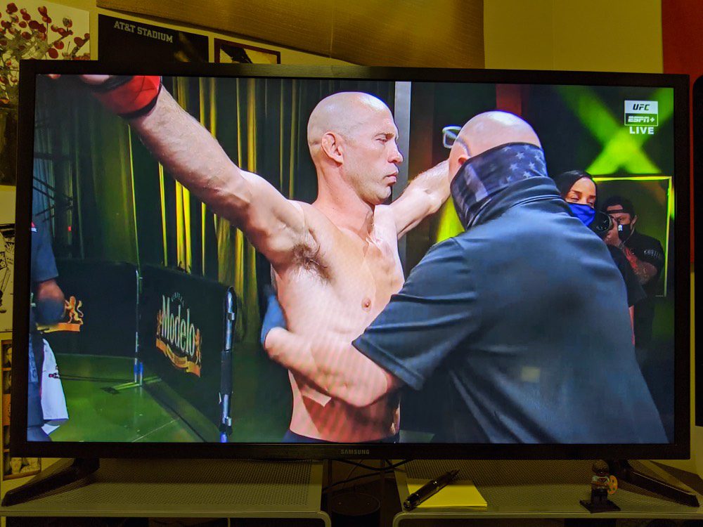
I use the ESPN+ app for one reason: to watch UFC content. Specifically, UFC Fight Nights, which are ~3 hour long events. These events have commercials, so I need to fast-forward through them quite often. And, because of the length of the events, I never view them in one uninterrupted sitting without needing to hit pause at least 12-20 times. I don’t believe either of those factors is unusual.
Initially, I was really impressed with this app because the video quality — 1080p at a solid bit rate — was dramatically better than the UFC Fight Pass video streams I was used to. However, that glow quickly faded as I struggled to use the app. Let me unpack some of the decisions ESPN made with this app combined with some of the limitations of the Google TV software/hardware.
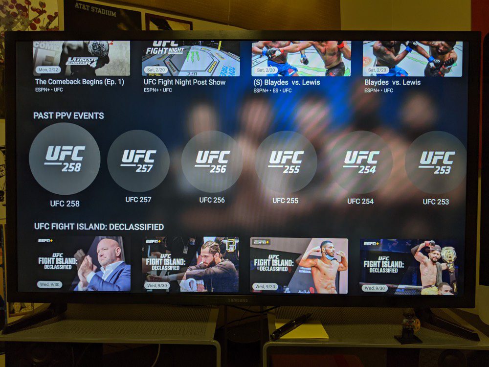
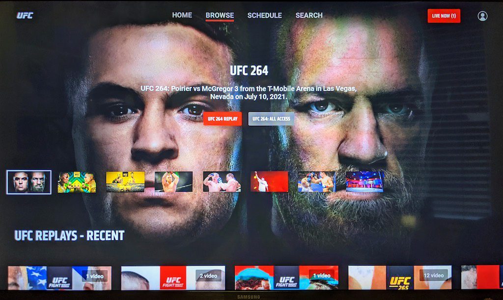
Before I dive into the horror show that is the ESPN+ app itself, the first frustration as a customer is simply finding the event I want to watch. ESPN+ is the exclusive home of UFC Fight Night events, so certainly they’d have a category for these events to browse through, right? No, they don’t. They’ve got 23 different categories you can browse through, and exactly zero of them are UFC Fight Night events. 😐
So how does a UFC fan find the Fight Night event they want to watch? By going into the search tool, and typing in the name of the fighter in the main card for the event — one character at a time — and searching for it through all the entries that come up. Do you know how painful it is to spell “Nurmagomedov” or “Jedrzejczyk” with a d-pad keyboard on letter at a time? Voice recognition doesn’t help if you can’t say the name in the first place. 😂 If this was the worst thing about the ESPN+ app, I could live with it. But, like the every second of The Road, it gets so much worse…
The first oddity with the experience is that — likely due to limitations of RAM and CPU power — the Chromecast doesn’t allow you to multi-task with apps. Want to hit pause on Netflix and pop into another app to do something, then back to Netflix? It will restart the app, putting you back at the Netflix home screen.
This is mildly irritating, but not a showstopper…so long as the app remembers where you were in the video. But — are you ready for this — the ESPN+ app does not let you resume the video. When you restart the ESPN+ app, it either dumps you to the home screen (where they is no “Continue viewing” option because you CAN’T continue viewing) or it dumps you into the sporting event you were watching…but it resets the event back to the beginning.
Imagine for a moment if Netflix, HBO Max, Prime Video, or any other video streaming app worked this way. You’re watching a movie, but can’t finish it, so you come back to it the next evening and instead of resuming where you left off you have to fast-forward through it and remember what part you last saw. This is the most ridiculous concept ever, right? Yet this is the experience ESPN has given to Chromecast with Google TV users. 🤦🏻♂️
I contacted ESPN+ tech support about this several times because I couldn’t believe that this was functioning as intended. I thought for sure it was a bug or problem on my side. It took multiple emails back and forth to explain the issue — the people in tech support are not users of the app/service apparently — but the final answer I received was this:
“We understand you concern and would like to apologize as the feature for Resume Playback is not available as of the moment. We have forwarded your suggestion to the appropriate party for review.”
And would you believe it gets worse? When the Chromecast screen saver kicks in after 15 minutes (if I recall) dismissing the screen saver also resets the ESPN+ video content back to the start. 🤯 I am not making this up. It’s like the developers of this app got into a room and said “What kinds of things can we do with this app to make users really, truly hate it?” 😈 then gleefully executed every feature on that list with diabolical precision.
Did I mention Google doesn’t allow users to set the screen saver time period or turn it off completely? There’s a workaround involving installing a third-party screensaver, so this was the most solvable of the horror-show that is the ESPN+ app, but no user should ever have to go to such lengths to control something as simple as a screen saver timer.
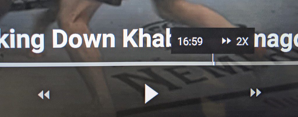
Let’s talk about the ESPN+ app design for a moment: it has several awful UX decisions, the worst of which is the fact that the d-pad on the remote doesn’t support fast-forward or reverse by clicking left or right. To go back or forward, you have to press left/right to bring up the controls, then on the d-pad select << or >> in the software, then select 2x to 8x, and to stop it you have to do a left/right press on the d-pad to get back to play, then click the d-pad center button to play.
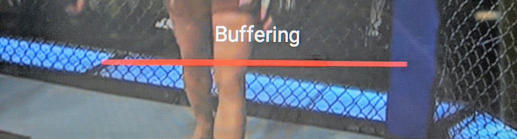
There’s no real-time visual of moving through the video, so you don’t know when to stop. It simply says “Buffering”. And the UI showing you the timeline goes away after 4-5 seconds, so it’s easy to FFWD and forget you’re doing it, ending up far past the point where you meant to be.
Yes, it’s as complicated as it sounds – it’s like the product manager had never used any other video apps before or wanted to be “creative” and come up with a method that no one else had ever done.
The ESPN+ app does get one standard control correct: pressing the d-pad middle button will pause a video, and pressing it again will un-pause the video. So…they’re 1 for 50 in the standardized video app Olympics. 😬
The UFC app is better…barely
Unfortunately, the UFC Fight Pass app on Google TV (the other app I use for UFC content) is just as frustrating in similar ways. I don’t recall having any complaints about the UFC app on Apple TV, but on Google TV the developers made some stunningly idiotic choices. Yes, that’s the theme here…
Here’s one example: when you’re on the timeline and click the d-pad once to skip ahead or back – what’s a reasonable timeframe for a replay or a skip, especially for a sports app? Maybe 15 seconds, 30 at the most. This app? 8 minutes! 🤯 I can’t even comprehend how any product manager would think this is the way the feature should work. Oh, and there’s no timeline scrubbing ether. Or fast-forward or rewind. Just 8-minute jumps. Who thought this was what customers wanted?
How about the short skip icons to the left and right of the play/pause button? They skip forward or back 30 seconds. That’s a bit much, but more reasonable. However, they screwed up this one too: logically, if you skip and the point you land on is wrong, you want to skip again, so the UX action on the d-pad should be a continuation of the last function. Do you know what happens instead? It puts you on the timeline and pauses playback. To get to the skip controls again you need to click down on the d-pad once, then click four times over to the right to get to the skip forward function. Yes, it’s every bit as awful as it sounds in day-to-day use.
Did they get anything right on the UFC app? Yes: if you’re watching a fight and click the middle button on the d-pad, it pauses the video. Clicking the same button again un-pauses the video. And you can pause and resume a UFC video from where you left off.
So in summary…
The experience of using these two apps on the Chromecast with Google TV was so frustrating, in May of this year I switched back to using an Apple TV. The same apps on the Apple TV work the way you’d expect: I can pause the UFC events, I can resume from the most recently watched point, and the d-pad clicks to the left/right will skip forward or back (on the ESPN app at least; the UFC app has some quirks in this regard). In short, it works the way you’d expect it to.
It’s a real shame because the Chromecast with Google TV is an excellent product in a lot of ways and overall, I enjoyed using it. It gave me, for the first time, the ability to control the volume level of my AudioEngine external speakers; this is something I can’t do with my Apple TV. But given the importance of these two apps to me, I had to switch back to the Apple TV.
I assume that ESPN+ and the UFC outsource their app development instead of doing it with an in-house team. The shocking differences between the Apple TV and Google TV apps tell me it’s unlikely they were developed by the same companies. Why do the development companies working on Google TV apps make such stunningly odd decisions and think they need to re-invent how customers interact with the videos in their app? And why do the people at ESPN+ and the UFC in charge of bringing these apps to market allow these poorly-designed apps to tarnish their brand and frustrate their customers? I have no idea. Perhaps it’s no accident that there’s no app ratings in the app store for the Chromecast… 🤔